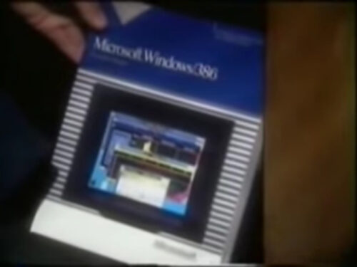
Microsoft’s got a pretty stellar track record of terrible Windows infomercials. Some for the consumer, some internal, all pretty rough. This 1988 video showcases Windows/386, a fairly impressive upgrade to Windows that introduced multitasking among other features. The impressiveness of the upgrade does not come through in this video. What begins as a dry-but-corny corporate…
Inspiration: Chemex
I’m a pretty big coffee fan, probably a little bit too much of one. I’d been hearing about Chemex as a brewing method and while it seemed a little TOO enthusiast for me, I finally decided to bite the bullet and picked one up. I brewed my first pot this morning and while the taste was heavenly (read: I saw God), I really just wanted to showcase the product and logo design here.
I’ve mentioned my affinity for 1970s design, and the Chemex really encapsulates that in a clean, simple way.
Such slick and simple lines, and the wood “handle” really gives it an earthy seventies feel. With products like these I’m always reminded of Star Trek. Mostly those episodes when they’d go back to Earth and the future-Earth is a really organic, natural landscape with amazing, clean technology residing within it.
The logo and brand design is no different:
That logo!
-ds