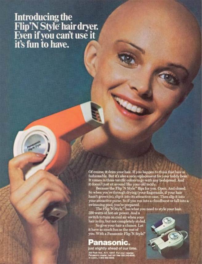
As much as layout and design trends change, beauty care ads are usually consistently crisp across eras. Case in point: these amazing magazine ads for hair care products, from the 1960s to the 1980s.
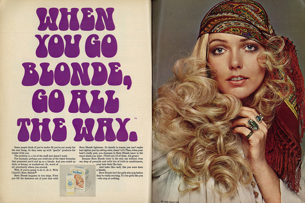
This gentle 1969 ad for what is no doubt a painfully savage hair dye goes a little out there with the font choice, but stays minimal and lets the eruption of blonde hair do most of the talking.
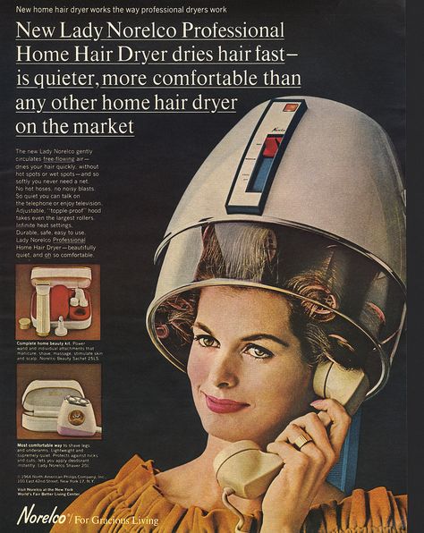
The Lady Norelco home hair dryer takes a space-age approach at selling an experience that could probably never happen, unless that phone is hooked up to an amplifier and/or the hair dryer is turned off. It’s an interesting choice to underline the headline, and the black space in the back really gives it a classy future-feel.
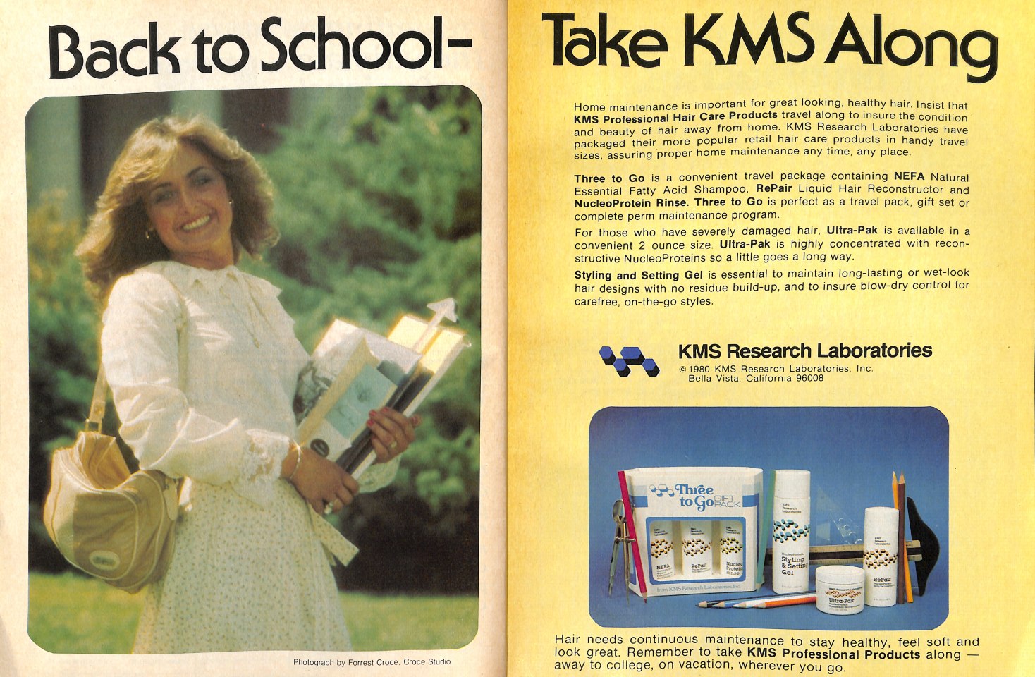
That font, that font, that font. Also that’s a huge “on the go” hair care package.
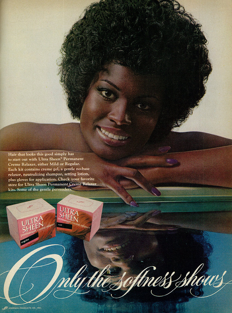
This one is the busiest of this batch, but the reflective pool against the white space on the top half of the ad gives the whole thing a very clean feel. I think this one is my favorite.
Wait, this one may be my favorite. The copy makes a neat point about using this thing to dry your fingernails, but I can’t imagine anyone made it that far.
-ds

