1. Protect and Survive – Coming right out of the gates with a downer!
Protect and Survive was a 1970s series of Public Service Announcements in the UK aimed at educating people of the things they needed to take care of in the event of a nuclear attack. Unlike a lot of nuclear propaganda from the time there’s not really a lot of paranoia here, just a stiff upper lip and a level-headed rundown of what would need to be done. The even tone of the PSAs makes the whole thing even more chilling, particularly when they’re explaining how to bury and tag a body in terms even a child would understand.
The thing is, horrific what-if aside, there’s a lot to love about this series. The graphics and animations are great and the soundtrack is a chilling synth dream.
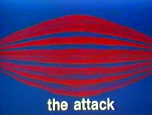
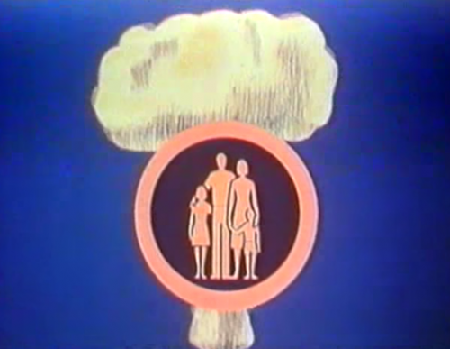 The opening graphic of each PSA.
A visualization of what the attack siren will sound like.
A visualization of the Fallout Warning.
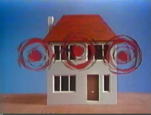
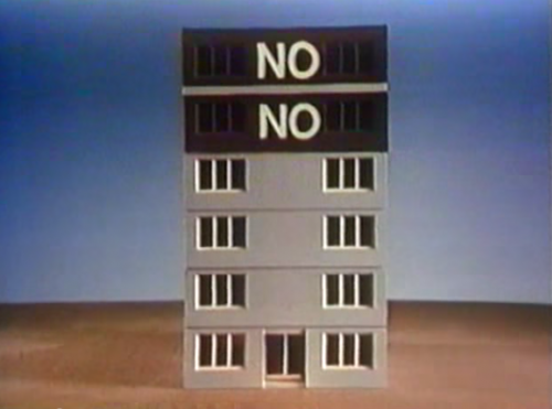 The top two floors are bad for fallout!
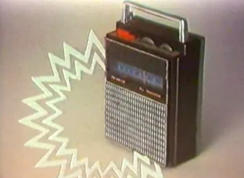 An unnecessary but beautiful graphic of the radio making…sounds.
Watching this compilation of PSAs really affected me in a way a lot of these nuclear attack preparation videos haven’t. I think it’s that the practical approach to survival and daily life highlights the reality of just how horrific this situation would be for a family. This was a genuine concern back then, and finding something that doesn’t over-dramatize this already dramatic situation makes it more…real.
Here’s the whole string of them.
2. Wizards and Warriors II: Ironsword (NES) – Here’s an amazingly overproduced commercial for Wizards and Warriors II on the NES. Parents, don’t sweat the bare-chested Adonis coming into your childrens’ room from the closet. He’s just recruiting them for an epic adventure.
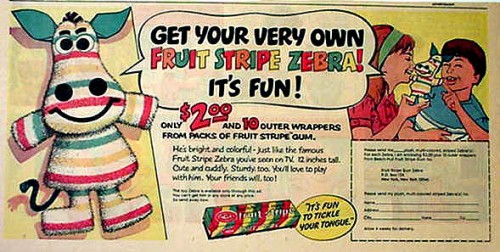
3. Fruit Stripes Ad – This stuffed Zebra only costs two dollars and three cavities!
4. Nickelodeon Logos – Check out this roundup of all Nickelodeon’s logos from their inception to today. It’s neat to see not just how graphic design geared at kids changed over the years but also the evolution of what TV graphics could do. My favorite Nick logo is still the early ’80s “balloon” font.
https://youtu.be/uangjIX9j5c
Also, 1980-1981….what?!
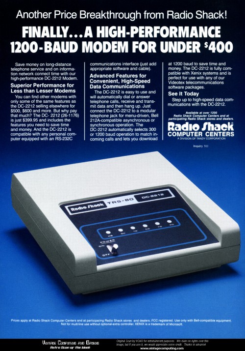
5. DC-2212 Ad – This was probably a fantastic deal for an incredibly slow modem back in the day. The typesetting makes it a gorgeous ad, without even trying.
-ds

