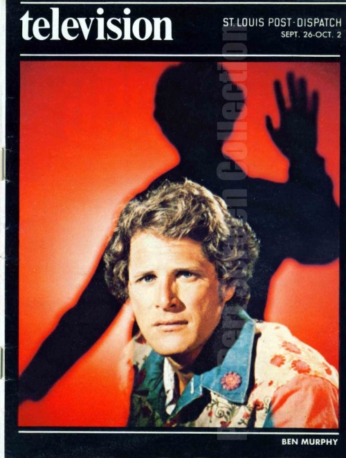
1. Gemini Man – In 1976 someone had the bright idea to make an action series on TV based on H.G. Wells’ The Invisible Man.
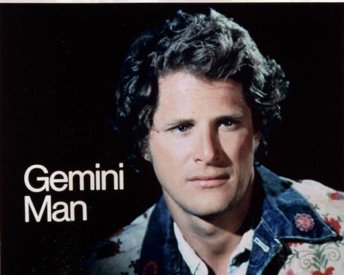
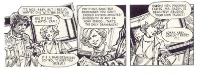
Called Gemini Man, it featured established TV actor Ben Murphy as a special agent who had had some sort of accident which turned him invisible. He wore a watch which helped him control this, allowing him to become invisible for 15 minutes every 24 hours. What a weird restriction to a super power.
The show itself lacked a defining edge, and fell into a vat of similar sci-fi-themed action television shows of the 1970s. That’s not necessarily a bad thing; there’s a lot of awesome stuff about those shows. The “future” technology is usually a pretty fun variant on an already-extinct technology, like reel-to-reel computers that filled up an entire room, and the futuristic outfits are usually the same way. Plus, these shows are a font-lover’s dream.
Gemini Man lasted one season and then was no more. In that year, it spawned a couple of gorgeous magazine covers:
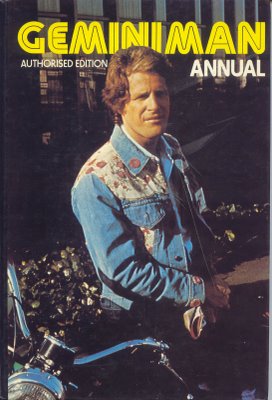
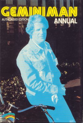
The Annual included a comic intro, linked from fourcolorcraic:
In 1981, somebody slapped two episodes together and called it a TV movie. Titled “Riding with Death”, the movie was featured on Mystery Science Theater 3000, which is how it got on my radar. I loved the episode so much that I found and watched (some of) the first season.
Stick with the MST3k episode.
2. London 1927 – Check out this amazing color video of London in the 1927. Really, stunning:
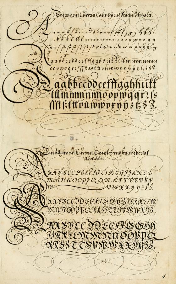
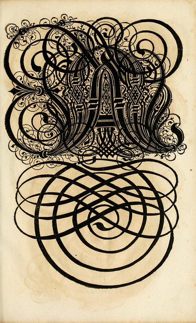
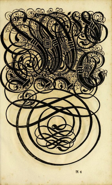
3. 17th Century Fonts – Here’s a 17th Century book on the art of writing, complete with amazingly, beautifully unreadable fonts.
4. 1981 Atari Ad – I have to admit, the Atari gameplay footage looks fantastic here. The colors really pop. And that music button at the end is perfect.
5. Salvador Dali on What’s My Line – Just that. It’s awesome.
-ds